This is an archive of the ArtCat Zine, 2007-2009. Please visit our new project, IDIOM.
March 2009

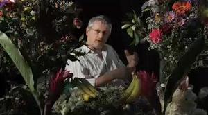
Olympia Lambert recently corresponded with artist Terence Koh on occasion of his participation in KKK, a three-person exhibition curated by Javier Peres and opening later this week at Mary Boone Gallery. --B.B.
Olympia Lambert for ArtCat: Hi, Terence. As your three-person Mary Boone exhibition fast approaches with the delectable fellow K's-- Koons and Kelley -- I'd like to ask you the following questions. Feel free to add additional commentary if you choose. My own opinion of you is ever-changing. When you told me you like when "people get over what they assume who I am to who I think I really am," it opened up a whole new way in which I perceive you, as well as your body of work. As an artist, are you specifically making it with an audience in mind, or is that audience yourself? Considering for a moment the second option, do you think this is why it's so difficult for people to understand the "real" you?
Terence Koh: i make art for other people. being an artist for me is for the better of society and the better of history. and it's always been the same individual, me as terence koh that does this. i doo what i doo what comes naturally. i am a servant to history. and i want to leave the world more beautiful through what i doo. and there are so many ways to express love, so there are so many "me's" to do that cause the world is all so different so have to be so many different facets of ambassadors.
AC: What exactly does your new sculpture entail for the KKK show, and what is its point of reference in terms of the progression of your body of work over the past decade?
TK: it is a 21 ft porcelian urinal that has been smashed up and reglued again. i don't tink i have been able to get any progress into my work though i have been trying. nothing seems to be getting better.
AC: Given the challenges in the economy, where do you see monumental art fitting in, given the continuing downturn in the art market?
TK:i find it difficult to answer most of your questions so far. all art is monumental. just as all art is spectacular and gigantic. the economy is just like waves in the ocean but it doesn't really affect the sea cause its still the sea. i do not mean to be poetic in this answer but its the closest answer i can know how to express for your question.
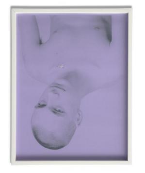
AC: Many of your works have at their core a makeup of degradable material -- blood, sweat, tears, semen, corn syrup, powdered sugar. Do you think of your work in terms of a correlation to their eventual decomposition, or is there no time line to what you feel they will represent?
TK: we have a contract when people buy my artwork that if the artwork changes it is the intention of the artist. and that is the truth. i always have flowers around my house and i like it when they shrivel up and die. i never throw away any of my flowers, i keep all of them in boxes. they are still equally as perfect as the day they were cut and died.
Several events in New York tonight call for some attention. First, in Chelsea, X hosts a public discussion between art historians Hal Foster and David Joselit as they discuss "recessional aesthetics" and whether the recently reconfigured public relationship with the material -- evinced most explicitly in the past few days by the populist furor over the 2009 AIG bonuses in this country and symbolic but grave actions across the European continent -- will necessarily compel a change in the public relationship with the cultural.
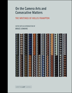
The New School, meanwhile, hosts a panel on girlhood, with a distinguished all-female group of speakers attending, including musician Kathleen Hannah, writer McKenzie Wark and several others. Anthropologist Michael Taussig will speak at NYU on a yet unpublicized topic. Further west, Renwick Gallery presents with the second night of its first invitational performance series, featuring Alexandre Singh, Tyler Coburn and others. And finally, Anthology Film Archives continues their second day of Hollis Frampton's Hapax Legomena series, coinciding with the recent publication of the intensely ambitious filmmaker's collected writings. It's also worthy of note that Anthology has arranged a group of remarkable guests to introduce the individual film programs of the cycle, including Keith Sanborn, Annette Michelson, P. Adams Sitney, Bill Brand, Bruce Jenkins and Gerry O'Grady.
The problem of critiquing the critical lingers large in the realm of performance. This is due, I suspect, to the fact that unlike any other serious medium, there remains a powerful industry devoted to psychological realism – the well-made play and the like. It's an industry that, in short, still orients itself by a 19th century standard of beauty. Jokes about painting non-withstanding, this is not the case in the art world, which is now several generations removed from the introduction of the abstract, the conceptual, and the critical into the edifice of its reception. Most patrons of performance and many of its producers, by contrast, are often, and at best, only dimly aware of some other history lurking in the margins. This obvious tragedy has many causes, and many more symptoms, one of the most pernicious being the general lack of a common vocabulary amongst critics, producers, and artists. It is no surprise, to put it another way, that so much of contemporary artistic practice relies quite heavily on an apparatus of orientation existing outside the work itself: the press release, the brochure, the critical assessment. Over time these many bits of explanation collect and calcify into a thriving community capable of digesting, even demanding, an ever-evolving, relentless assault on the status quo.

Last night at the X Initiative, Lindsay Pollack led a panel entitled AFTER THE DELUGE? PERSPECTIVES ON CHALLENGING TIMES IN THE ART WORLD. The topic was clearly on the minds of many, as well over three hundred people packed the second floor of the old DIA space. With early Derek Jarman cycling eerily in the background, and the oblivious, hissing steam pipes quickly bringing the room to a broil, Pollack peppered Jefferey Deitch, of the eponymous Projects, Brett Littman, ED of The Drawing Center, Michael Rush, Director of the Rose Museum and Anya Kielar, doing double duty as an artist and as a former gallerist at Guild & Greyshkul.
The combination of the heat, the disparate panel, and the who's who crowd could easily have led to an heaping serving of platitude before everyone slunk up 10th avenue to one of the myriad openings on offer. Fortunately for all, Pollack took the opportunity to remind everyone in attendance how refreshing good journalism can be, and her guests, perhaps sensing that they were among friends, were remarkably candid and open, even as Pollack hit them with multiple follow up questions.
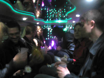
On the last day of this year’s Armory Show, a friend and I made our way out to 12th avenue and climbed into the back of a limo. Joining us were several other people, a host from Art International Radio, a woman playing a toy piano, a man playing a violin, a composer, several bottles of champagne, and the co-curator of the event, Sonya Hofer. We took off down the West Side Highway as the composer handed out postcards displaying various abstract ink drawings.
“Hand them to the musicians and they will play what’s on the card,” he explained. There was a pause before someone turned over a card featuring an image of a cat and a dog. The woman playing the piano immediately launched into a vigorous composition. The violin followed suit. Champagne was poured. “So,” said the host, “what is your favorite thing in the world?”
“Art!” offered somebody, another preferred love, still another made a case for music. A discussion ensued as the limo turned left and the violinist began to make little barking noises. “And the worst thing?” the host piqued, pouring another round; hate, abuse, disappointing someone, and getting up in the morning, came the replies. The violinist was really yelping now, and the woman at the piano looked pleadingly at the passengers. “I suggest,” said the composer, an elegant man in shoulder length hair, small glasses and a stylishly rumpled suit, “that you hand them another card.” A general dawning spread throughout the cabin and several cards were quickly thrust forward. A star pattern prompted a shift to a sprinkling etude as the violinist indicted his gratitude.
The limo was somewhat cramped, as such vehicles always are, but a third round of champagne seemed to affect a general loosening: a husband sitting across from us confessed his wedding day to have been the best of his life. His wife, sitting next to him, spoke subsequently but chose differently, “Sorry, darling,” she said, to laughter. Some twenty minutes and three bottles later we were all of us back on the pier, somewhat tipsy, tilting our separate ways. A passenger pumped Hofer’s hand, “Wonderful, just wonderful” she beamed, before skipping back inside towards the fair.
Tomorrow evening Anthology Film Archives sees the New York premier of Michel Auder's The Feature, a major new work on high definition video. The culmination of over 40 years of often intensely personal diaristic video making, The Feature presents a three hour journey through the videomaker's life, one of any number of such narratives possible, as Auder himself states in the work's trailer. The video also features new footage produced with co-director Andrew Neel, grandson of painter Auder’s friend and video subject, Alice Neel. Michel Auder is an early pioneer of the video diary form, in whose legacy several generations of motion picture artists continue to work. The continual blending of life and work, and his long-standing collaborations, friendships and affairs with a remarkable cast of artists (Andy Warhol, Cindy Sherman, Annie Sprinkle, Gregory Corso, and others) distinguish his oeuvre as much as the emotional sophistication that runs throughout.
After premiering on Wednesday at 7, it will show again nightly through Tuesday 24 March.
Double Take
Johan Grimonprez
Sean Kelly - 528 W. 29th St, New York NY
7 March - 21 March 2009
Folgers coffee has never been so apt a metaphor. Johan Grimonprez's new film Double Take, on view this month at Sean Kelly Gallery in Chelsea, is punctuated by several decades' worth of advertisements for it, and for good reason: it's the archetypal “double.” The doting wife, always unable to satisfy her husband's quasi-erotic demands for good brewed coffee, replaces it with instant. The husband can't tell the difference — but the audience is left with an uncanny sense of foreboding, as if its own coffee cups were in imminent danger of being surreptitiously substituted for something else. This vague anxiety is the foremost feeling evoked, and cultivated, by Grimonprez's film.
Double Take is a long and tightly-controlled examination of the double on a variety of levels, yet it remains admirably disciplined in its selection of motifs. The topic, after all, is so extensive and so firmly-rooted in Western culture — another artist would have felt obliged to reference Cervantes or Joseph Conrad — that a treatment trying for breadth would inevitably have become a catalogue.
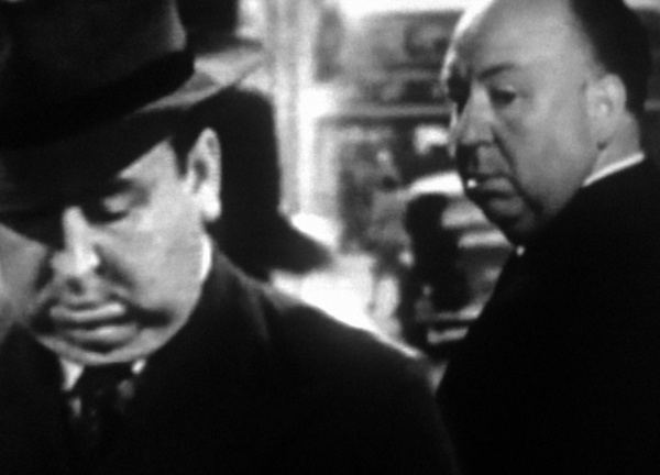
Here, there are only a few primary strands to untangle. The spine of the story is provided by a Borges essay, reworked into a preternaturally plausible account of Alfred Hitchcock meeting his double. Hitchcock's doubles in fact populate the whole film, along with Hitchcock's own on-screen and off-screen personae. The difference between the two becomes less clear and less relevant as the narrative proceeds; by the end, we are left with barely anything more than the stylized, trademark silhouette, filled out by an ever-shifting array of characters. The original Hitchcock, it seems, cannot help becoming his own murder victim — for, the film insists, if you meet your double, you must kill him.
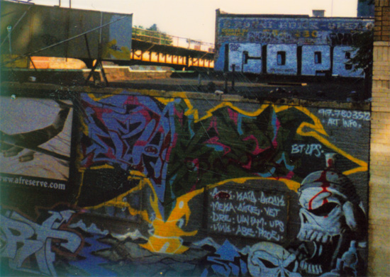
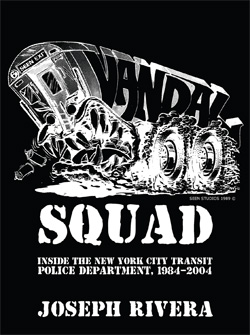
Judging by the thousands of books that have emerged over the years about graffiti you'd be forgiven for forgetting that it's an art form that thrives on its illegality, but with the recent release of Vandal Squad by powerHouse books that me be about to change. Former NYPD Vandal Squad cop Joseph Rivera has written a biography of sorts about his twenty years on the force (1984-2004) through the eyes of a native who chose to enforce the law against these artistic rebels. It's not your typical graffiti book but then Rivera isn't your typical author either.
Rivera's story begins with his admission that as a kid he would watch the trains go by decked out in graffiti and in the eighth grade he "caught my first and only tag on a city bus that ran on Tremont Avenue." It was a period when "materpieces, blockbusters and throw-ups totally covered the outside of the trains, and marker tags filled the inside of the cars." He admits that he "would look upon some of those pieces with awe" but he ended up in the Transit Squad in 1984 since he thought "this sure beats working at the deli."
His prose is simple but comes across as authentic and honest. He doesn't glorify the Vandal Squad but he has a deep respect for a police force that didn't always return the favor. First serving as a cop in the Transit Service and then as an officer in a unified NYPD, Rivera was perpetually overlooked for promotions. He suggests possible explanations for this but we are left feeling that the real reason may have ultimately eluded him.
During his 20 year journey as a Vandal Squad cop he meets characters of all types, including cops he clicked with and others he didn't. He writes about graffiti writers who stopped because of the threat of criminal prosecution and others who continued no matter the consequences. Some of the stories are interesting windows into the lives of these urban artists but others meander and would've benefited from careful editing.
But even among his laundry list of war stories, which includes run ins with everyone from the KGKASS Crew to the YKK Crew and most famously REVS, there are passing thoughts that give us insight into the essence of graffiti. When Rivera "collared" graffiti pioneer STAY HIGH 149 he discovered that the artist -- the author calls them vandals -- was a gentleman. "He gave us no problems whatsoever," Rivera writes. "He told us, 'I beat the drugs but I can't beat graffiti.'"
Tavares Strachan
The Boiler - 191 N. 14th Street, Brooklyn NY.
7 March - 19 April 2009
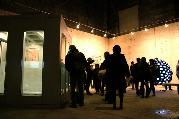
A 4.5-ton block of ice clinically lit by humming fluorescents and cooled within a solar-powered freezer, Tavares Strachan’s The Distance Between What We Have and What We Want, 2004-06 went on view Saturday at The Boiler, Pierogi Gallery’s immense additional space newly opened in Williamsburg. Strachan’s project takes center stage alongside others of ambitious scale by Yoon Lee and Jonathan Schipper.
At twenty-degrees Fahrenheit, Strachan’s stolid work sits brimming with narrative—social, political, and most obviously, environmental. Trace the ice en route (via FedEx) in July of 2006, from Alaska to the Bahamas, where Strachan lived as child, fascinated by ideas of snow and ice. There, the block’s first artistic iteration materialized as an educational tool for students at Albury Sayle Primary School in Nassau. His arctic fragment served as locus for conversations on mythmaking, as well as a flag-raising ceremony and other performances. Its relocation became a gesture of globalization, dissolving boundaries between disparate climates and sovereignties, reverberating the nation’s independence from the United Kingdom thirty-three years earlier.
By converting sunlight, inimical counterpart of The Distance Between..., his frozen matter resists a kind of death by displacement in its durational performance. If, as Robert Smithson believed, “entropy contradicts the usual notion of a mechanistic world view,” Strachan contradicts entropy, creating a necessary reliance on the mechanical in doing so. Roxy Paine’s Erosion Machine, 2005 comes to mind. Yet while Paine’s glass-and-steel sandblasting machine accelerates human inscription towards unimaginable severity, Strachan’s process stabilizes the damage. The ice is a conservational case study, memorializing the environment as we know it through an earnest attempt to sustain the unsustainable.
The installation glows, flanked by twin flatscreens displaying live climatic information for Alaska and the Bahamas. Yet another video feed displays the roof-mounted solar panels; the city skyline peeks from beyond the building’s edge. Nearly forty feet overhead, fans ripple altered Bahamian flags. Strachan belabors the ice-object, as if to thoroughly demystify it through a hyper-contextualization within, to borrow Smithson’s terminology, both site and non-site. Immoderate perhaps, still, uncertainties remain. Strachan’s ice ages undetectably. Distance grows greater.
Many viewers entered an artist’s room at Pool but then swiftly turned around and left. Pursed lips and glazed eyes on the artist’s face expressed silent frustration with another 30 second verdict. Dazed faces, the occasional scowl, and the sound of “shit” muttered in the stairwell registered how so many art lovers are eager to see primarily that which they have already admired in the past. It's true that all the work on view at Pool is by un-represented artists. Broadly speaking, much of this work is not in prefect lockstep with current trends. But this eccentricity is precisely what makes the works so interesting. Lets not forget when men looked cool in Pink, how quickly what is considered fashionable shifts.
Illustration can be a dirty word among some collectors and art critics. For example, in her recent review of the painter Ian Davis, whose work was on display at Volta, Roberta Smith fretted that their "fussy scale also makes them feel like big, clever illustrations that would be as effective in reproduction as on a wall... Mr. Davis's efforts become especially like illustration when he turns to monstrous factories that seem intended to convey the insanity of big business. Otherwise, his images have a clarity of theme and economy that constitute a good place to start figuring out how to be less cute."
Smith is just once voice in the art world but I she's hitting upon a prejudice against illustration that others share with her. It smacks of dividing visual culture between high and low and its keeping people from buying and appreciating good work by draftsman and painters that emphasize line.
I used to think of Pulse as the hip, younger cousin to the Armory, the one who you feel weird about admitting any familial relations. Now I think it's more like the rich aunt: very kind, generous, always perfectly put together, but a bit cold and aloof. In no way is this a judgment on the art or the presented projects but just a general overview of the scene. In fact, as far as art viewing and the constraints of space go, Pulse does not disappoint. Nearly every booth is straight up curated and perfectly contained, using just the right wall-space-to-art-work ratio, while presenting works on paper, canvases, photographs, installations, video, and even performance. Much like the general air of a slightly defeated, somewhat despondent, but mostly just optimistically reinvigorated air of New York City in the wake of our oft-discussed economic gutter, creative energy abounds. Gallerists are friendlier, perhaps knowing that while uber-success may not be in the cards, exposure and zealous curiosity is still the underpinning that draws the bulk of the spectating hordes. Don't get me wrong: tight-faced, bedazzled ladies still make their appearance but perhaps less so at Pulse this year.
DCKT Contemporary's presents a meticulously curated show of work by Cordy Ryman -- whose small abstract paintings, sculptures and installations use a variety of material to poke fun at the contrivances of visual language while exploring the nuances of "artistic" versus everyday material. Prague's Vernon Galerie shows a very complicated project by Jakub Nepras that, while intensely gripping, was too complicated for my short attention span. The gallery brought an impressive array of work. Like an Olympic triumph, Pulse victoriously passes the torch by showcasing galleries from distant lands, including notables Chi-Wen Gallery from Taipei, Space from Bratislava, Habana from Havana City and Silver Lens Gallery from Manila. Adding to the fun are the numerous installations, as part of the Pulse Installations series, for which individuals artists were commissioned to do a slew of diverse work, in case viewing art in contained booths is simply not your thing. Clifton Childree's hilarious abandoned tropical shack titled Miamuh Swamp Adventure, is a dilapidated construction that viewers enter to find a slapstick silent film about Miami real estate scams from the turn of the century -- a perfect piece during which to take a break, check your email or make out. Laure Prouvost's Close your eyes, you are the only one is a sound piece that serenades you with spam and chain mail. Miriam Cabessa meanwhile spent hours painting her performance piece Slow Motion Action Painting, which admittedly lacked in action but delivered on the "slow."
The little Hegel is all of us is tempted to dismiss pop art. It may no longer be revolutionary to appropriate commercial imagery and style into visual art, but Volta’s booths proved it still has some mileage left.
Now in its true late style, we are well aware of the strengths and -- perhaps more importantly -- the limits of Pop. Indeed, the willingness to explore and harness its weakness is precisely what sweetens these late chapters. That content, light and fluffy as cotton candy, and with half the substance, can surely backfire into the meaninglessness of elevator music or small talk. But this idea of backfire is now the point. A Pop style can visually indict its subject as a pleasant lie or polite fiction that conceals an inconvenient truth.
The paintings of Shen Jingdong at the stand of New York’s China Square gallery attack the fiction of the content army and the happy family. Casting these social ideals as smiling children’s toys reminds us that it’s a juvenile over-simplification to think in such saccharin terms: bringing up teenagers is practically masochistic for any parent and memories of combat haunt even the toughest veterans. As sparkles of light dance on new plastic, Shen Jingdon proves that not all that glitters is gold.
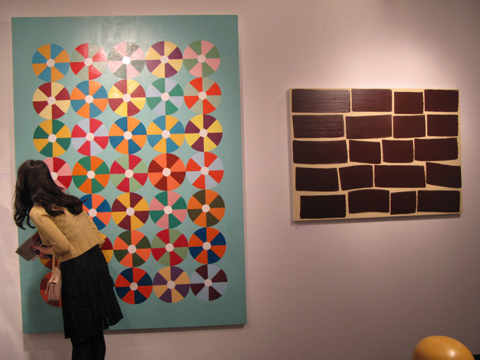
I can still remember the glorious days of yore (2004) when Scope was held at the not-yet-opened-but-with-a-pool Gansevoort Hotel. as the Meatpacking was quickly becoming the glorious "bridge and tunnel" cesspool, coinciding with Samantha Jones' move to the neighborhood and its quick and structural demise.The dark and swanky hotel rooms, the copious Kettle One everwhere and those frozen tubes of neon corn syrup they peddle in the local bodegas -- except this time melted and intended for use as mixers: it's a memory of sensation. Alas, Scope has changed -- neigh, revolutionized, in many ways. The air of disorganized merriment notwithstanding, the fair is now a whole new animal.
Tightly wedged between Fordham Law and Lincoln Center, Scope's highbrow neighbors are an apt consortium for the fair's presence. Scope now fills a chorus line of tents that give way before giving way to a harmonious range of galleries, individual artist projects and other sundry exhibitors. A number of notable galleries quickly draw you into their strongholds, either with great art or free wine. Let's face it, a great and timeless match that I can and will not refuse. (Huevos rancheros?) Glass and camera in hand, I immediately noticed the charming folks of Okay Mountain, an artist run gallery from Austin. Exhibiting their own collective work as well as other artists from the gallery, they had a visual cornucopia of sculpture, digital prints, works on paper, various large multi-media pieces and a friendly disposition. Further along and part of the special artists' projects that the Scope Foundation has commissioned is Comenius Roethlisberger and Admir Jahic's Without You Babe, There Ain't No Us, originally shown at Scope Miami just a few months prior. A series of works on paper utterly preoccupied with YouTube, Without You Babe... offers an antidote to the tendancy for art as a pixelated screen grab. The artists render their obsessively over-watched favorite moments with the soft markings of colored pencils, streaming online pop culture videos into simple, contemplative scenes.
Before you even make it through the lobby of the 2009 Armory Show, the headlines of The Art Newspaper – one of the rare items at the fair without a price tag attached – offer a clear indication of the year’s underlying theme. “New Pier 92: Art of the Depression… the 1930s, that is;” “Financial Situation Forces Gallery Withdrawals;” and finally, the lead story grins through clenched teeth: “Economic Downturn Prompts Stand-Out Booths.” In recent months, the art world has been hit particularly hard by the global recession, a downturn that has reversed trends of blank check opulence and rendered Damien Hirst-style momemto mori itself momento mori. Galleries are scaling back, and as Holland Cotter declared last month in The New York Times, it’s “day-job time again [for artists] in America.” But in spite of looming fears and shrinking wallets, this year’s Armory Show moves valiantly forward and strives to distinguish itself in its refusal to cut corners. While last year’s fair registered a record 50,000 attendees, it’s obvious the curators now hope to exceed that number, incorporating an extra pier into the Armory’s already labyrinthine layout and increasing the show’s size by an additional 50%.

House of Cards
Lisa Kirk
Invisible Exports - 14A Orchard Street, New York NY
20 February - 29 March 2009
One of the most provocative pieces in Revolution, Lisa Kirk's self-described "fragrance lab and terrorist headquarters" exhibited last summer at P.S.1, was a commercial for a product dubbed "Revolution: the Fragrance." Shot in the style of an overaestheticized Nike ad, the short cut between stylized Manhattan street scenes and two sets of runners (joggers? Thieves?) sprinting down the sidewalks of the Lower East Side. At the commercial's end, a bomb explodes, and with no shortage of gravitas the camera pulls back to expose two black-clad figures slowing to meet each other. Masks come off, a detonator is revealed, and the logo: Revolution… the fragrance.
Lisa Kirk, in other words, is no stranger to exploring and mocking the perversities of late capitalist society. With Revolution, she dissected popular culture's urge to fetishize and commodify transgression, and now, with House of Cards, her latest show currently at Invisible-Exports, she examines a related theme: the tension between capitalism's values and its increasingly rapid decline.
House of Cards (or Maison des cartes, as the promotional material sneers) is, at first glance, a stark aestheticization of poverty. A shanty within a gallery, the viewer enters the space through walking into a tin shack with tires framing the roof and door. Once inside, the house is fully equipped with a kitchen (stacked tires and a metal bowl) a bed (scrap materials next to a 1964 encyclopedia) and a bathroom (a hole in the wall thoughtfully accompanied by a hanging roll of toilet paper). While ostensibly a critique of commercialism, with its ironic pragmatism and DIY feel, House of Cards departs from the frontal approach of Revolution and takes a slightly different tact. Appealing to freegans aesthetically and consumers directly -- "Invest in who YOU are and what YOU stand for" – the show implicates everyone within the market economy by suggesting first that capitalism is headed to the favelas, and second, that in hard times, the revolutionaries and the rich start to look awfully alike.
Advertised as a "shanty timeshare," the work itself is composed of 52 different pieces of found materials, and can actually be rented or purchased through one of three different payment options. Under the basic option (an all-time low of $199.99!) the timeshare owner is granted a deed and a week in the shanty, and under the silver and gold options, the owner buys a week, a deed, and a piece of the shanty itself. In order to avoid the confusion of running a timeshare out of the gallery space (although it seemed to work rather well at the Guggenheim) come early March, the shanty will take up residency in the Brooklyn Navy Yard. At the end of the year, the pieces will be disassembled and distributed to timeshare owners "as 52 separate and unique artworks." If you have any questions, you can consult the realtor. His office is directly behind the shanty.
As Kirk's press release points out, House of Cards is more than just a satire of consumerist society. It's also an invocation of one of the most powerful images in contemporary global politics. As Mike Davis famously argued in Planet of Slums, poverty is not only one of the most entrenched and overlooked social problems in the world, it's also one of the fastest growing, metastasizing at a rate that far outpaces those working against it. In House of Cards, Kirk calls upon this history, but in tying the image of the shanty to Western materialist values, she casts a darkly ironic light on one of Davis' central questions: "Are the great slums, as a terrified Victorian middle class once imagined, volcanoes waiting to erupt?"
Not anymore. They're waiting to be sold to the highest bidder. And if you're looking for revolution, it can be found downstairs, where parts of her P.S.1 show are on display.
ZINE
HOME
TIPS / COMMENTS
CATEGORIES
CONTRIBUTORS
- Greg Afinogenov
- B. Blagojevic
- Adda Birnir
- Susannah Edelbaum
- Julie Fishkin
- Paddy Johnson
- Jessica Loudis
- Christopher Reiger
- Andrew Robinson
- Peter J. Russo
- Blythe Sheldon
- S.C.Squibb
- Hrag Vartanian

