This is an archive of the ArtCat Zine, 2007-2009. Please visit our new project, IDIOM.
Recently by Jessica Loudis
When Mark Essen first started designing video games in high school, he never anticipated that it would make him a name in the art world. Now, not so many years later, Essen is the second youngest artist in the New Museum’s Younger Than Jesus show (limited, of course, to artists under 33) and one of the fastest rising stars in the growing field of video game art. Known for his Atari-inspired designs and black-humor-driven plots, Essen’s games take a page from the 8-bit games of 80s and build on them, adding new aesthetic and thematic layers to cultural objects still ripe with associations of parents’ basements and misspent youth. Creating games that are both frustratingly difficult and undeniably addictive, Essen is a gamer’s designer, a programmer whose format is deceptively simple while the logic behind them isn’t. For those not weaned on the mushrooms of Mario or the asteroid belts of Starfox, Essen’s work may seem to come out of left field, but as the Younger Than Jesus subway ads say, “This is the voice of a generation. Some translation required.” --J.L.
Jessica Loudis for ArtCat: You studied with several filmmakers while you were a student at Bard. Is there a connection between cinema and video games?
Mark Essen: There’s certainly a visual connection, and there’s also a social connection sometimes, like when you get a new game and sit down with it or you’re watching a film for the first time you’re kind of lost at first, trying to grasp the logic of the storytelling or experience. I don’t know if that makes them that related; you could say the same thing about music. I guess the major connection is that both games and films are presented in a similar way, but the role of the audience is different to each. In a movie maybe you’re trying to get into the mind of the director or whatever, in a game you’re thinking about that, the designer, and also the guy playing. Maybe you’re playing too. It’s a process of trying to figure out what the other guy’s thinking.

AC: How do you think difficulty affects the way people perform or interact with your games?
ME: There’s a lot of repetition, so it becomes an endurance test in a way. Punishment 2 is an example of this. At every level you need to go to the top of that level, and at every new level you have to go to the bottom of a tower. So it’s up, down, up, down and on each screen you’re dying fifty times before you beat it, before you can advance. It’s not very fun, I guess. It’s a test of will. If you’re playing the game alone at home it’s just masochistic, but if you go to a party and sit down with someone it becomes cooperative. It takes two hours, maybe, for newcomers to get all the way through it. Meanwhile, a crowd is watching you, they’re coming and going, and you’re on stage.
Before you even make it through the lobby of the 2009 Armory Show, the headlines of The Art Newspaper – one of the rare items at the fair without a price tag attached – offer a clear indication of the year’s underlying theme. “New Pier 92: Art of the Depression… the 1930s, that is;” “Financial Situation Forces Gallery Withdrawals;” and finally, the lead story grins through clenched teeth: “Economic Downturn Prompts Stand-Out Booths.” In recent months, the art world has been hit particularly hard by the global recession, a downturn that has reversed trends of blank check opulence and rendered Damien Hirst-style momemto mori itself momento mori. Galleries are scaling back, and as Holland Cotter declared last month in The New York Times, it’s “day-job time again [for artists] in America.” But in spite of looming fears and shrinking wallets, this year’s Armory Show moves valiantly forward and strives to distinguish itself in its refusal to cut corners. While last year’s fair registered a record 50,000 attendees, it’s obvious the curators now hope to exceed that number, incorporating an extra pier into the Armory’s already labyrinthine layout and increasing the show’s size by an additional 50%.

House of Cards
Lisa Kirk
Invisible Exports - 14A Orchard Street, New York NY
20 February - 29 March 2009
One of the most provocative pieces in Revolution, Lisa Kirk's self-described "fragrance lab and terrorist headquarters" exhibited last summer at P.S.1, was a commercial for a product dubbed "Revolution: the Fragrance." Shot in the style of an overaestheticized Nike ad, the short cut between stylized Manhattan street scenes and two sets of runners (joggers? Thieves?) sprinting down the sidewalks of the Lower East Side. At the commercial's end, a bomb explodes, and with no shortage of gravitas the camera pulls back to expose two black-clad figures slowing to meet each other. Masks come off, a detonator is revealed, and the logo: Revolution… the fragrance.
Lisa Kirk, in other words, is no stranger to exploring and mocking the perversities of late capitalist society. With Revolution, she dissected popular culture's urge to fetishize and commodify transgression, and now, with House of Cards, her latest show currently at Invisible-Exports, she examines a related theme: the tension between capitalism's values and its increasingly rapid decline.
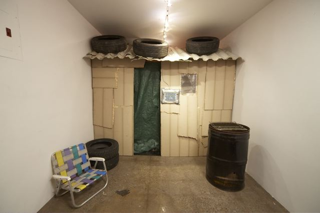
House of Cards (or Maison des cartes, as the promotional material sneers) is, at first glance, a stark aestheticization of poverty. A shanty within a gallery, the viewer enters the space through walking into a tin shack with tires framing the roof and door. Once inside, the house is fully equipped with a kitchen (stacked tires and a metal bowl) a bed (scrap materials next to a 1964 encyclopedia) and a bathroom (a hole in the wall thoughtfully accompanied by a hanging roll of toilet paper). While ostensibly a critique of commercialism, with its ironic pragmatism and DIY feel, House of Cards departs from the frontal approach of Revolution and takes a slightly different tact. Appealing to freegans aesthetically and consumers directly -- "Invest in who YOU are and what YOU stand for" – the show implicates everyone within the market economy by suggesting first that capitalism is headed to the favelas, and second, that in hard times, the revolutionaries and the rich start to look awfully alike.
Advertised as a "shanty timeshare," the work itself is composed of 52 different pieces of found materials, and can actually be rented or purchased through one of three different payment options. Under the basic option (an all-time low of $199.99!) the timeshare owner is granted a deed and a week in the shanty, and under the silver and gold options, the owner buys a week, a deed, and a piece of the shanty itself. In order to avoid the confusion of running a timeshare out of the gallery space (although it seemed to work rather well at the Guggenheim) come early March, the shanty will take up residency in the Brooklyn Navy Yard. At the end of the year, the pieces will be disassembled and distributed to timeshare owners "as 52 separate and unique artworks." If you have any questions, you can consult the realtor. His office is directly behind the shanty.
As Kirk's press release points out, House of Cards is more than just a satire of consumerist society. It's also an invocation of one of the most powerful images in contemporary global politics. As Mike Davis famously argued in Planet of Slums, poverty is not only one of the most entrenched and overlooked social problems in the world, it's also one of the fastest growing, metastasizing at a rate that far outpaces those working against it. In House of Cards, Kirk calls upon this history, but in tying the image of the shanty to Western materialist values, she casts a darkly ironic light on one of Davis' central questions: "Are the great slums, as a terrified Victorian middle class once imagined, volcanoes waiting to erupt?"
Not anymore. They're waiting to be sold to the highest bidder. And if you're looking for revolution, it can be found downstairs, where parts of her P.S.1 show are on display.

Jessica Loudis recently reviewed Trevor Paglen's Blank Spots on the Map: The Dark Geography of the Pentagon's Secret World, published earlier this month by Dutton. Loudis' review will appear in a forthcoming issue of the Brooklyn Rail, but is currently available on her blog. In addition to reviewing the book, Loudis had a chance to talk to Paglen about this project and others. Their conversation is reproduced below. -B.B.
Jessica Loudis:One theme that you develop at great length in the book is the relationship between geography and legality, or the idea that the unmapped and invisible directly inform what eventually becomes permissible in the white world. Could you elaborate on why you think geography is interconnected with law in this way?
Trevor Paglen: Geography is about facts on the ground. If you build something or institute some kind of system or program, what you’re doing is producing space. You’re producing facts. Oftentimes if we’re talking about secrecy or classified programs, these happen outside the law. Covert actions, covert programs, are such oftentimes precisely because they’re illegal in some way, there’s something outside the law about them. So what tends to happen over and over again when you look at the history of this stuff is that those facts on the ground intersect the legal system and in order to preserve them the legal system has to bend around them. There’s a case history that shows exactly this, and it goes back to a precedent called United States v. Reynolds. Now, we see that precedent used over and over and over again, for everything from NSA wiretapping to extraordinary rendition, to cases about CIA black sites. What you’re seeing are these facts on the ground carving out a blank space in the law. But I think what’s crucial here is that the facts on the ground of this stuff -- the materiality of it, the geography of it -- precede the legal stuff surrounding it.
Some True Stories:
researches in the field of flexible truth
Storefront for Art and Architecture - 97 Kenmare Street, New York NY
18 November 2008 - 23 December 2008
There’s always something disconcerting about going to an exhibition at the Storefront for Art and Architecture. Perhaps it’s the fact that entering the Storefront feels like walking into a vertical jigsaw puzzle, or, that once inside, the gallery’s shallow floor space and antiseptic design create the impression of being inside the spaceship in 2001. Whatever the reason, this sense of disorientation lends itself well to “Some True Stories: researches in the field of flexible truth,” currently on view at the Storefront. “Some True Stories” is a multimedia installation orchestrated by ten architects – including at least one who moonlights in the Bon Savants – working under the direction of Yale architect and theorist Keller Easterling. Encompassing the genres of theater, globalization, network theory and literature, Easterling's work is oriented around expanding the traditional definition of architecture, and doing so through an eye to the idiosyncratic. Her most recent book, Enduring Innocence, included chapters on North Korean tourist infrastructures, agricultural urbanism and 21st century pirates — topics that reflect Easterling’s intent to develop a more inclusive architecture along political and geographic axes.
In Twilight of the Idols, Friedrich Nietzsche wrote that “the most powerful men have always inspired the architects; the architect has always been influenced by power,” and it is with this sentiment that Easterling's press release seems to resound. The show employs the notion of the hoax – taking form here as commercial design – to attractively present fiction as fact and call into relief architecture’s sociopolitical implications. Masquerading as advertisement, the exhibition draws attention to architects' role as arbiters of space, converting useless or unwanted sites into desirable ones, and for better or worse, drawing everything they touch into the global economy.
Upon entering the Storefront, the visitor is immediately greeted with a series of sleek Shell Oil-style ads proudly featuring "VPL," a fictitious company promoting a high-speed railway line between three California airports. These ads, the work of Rustam Mehta and Thom Moran, pair the "jargon of complexity theory and the business model of Las Vegas casinos" in the service of selling the railroad and promoting an industrial/residential campus in the desert between the airports. "Part airport city, part casino and part suburb," the press release reads, transforming a formerly barren space into a paradigm for hyperconnected 21st century living.
ZINE
HOME
TIPS / COMMENTS
CATEGORIES
CONTRIBUTORS
- Greg Afinogenov
- B. Blagojevic
- Adda Birnir
- Susannah Edelbaum
- Julie Fishkin
- Paddy Johnson
- Jessica Loudis
- Christopher Reiger
- Andrew Robinson
- Peter J. Russo
- Blythe Sheldon
- S.C.Squibb
- Hrag Vartanian


