
This is an archive of the ArtCat Zine, 2007-2009. Please visit our new project, IDIOM.
Illustration at the Pool Art Fair
Many viewers entered an artist’s room at Pool but then swiftly turned around and left. Pursed lips and glazed eyes on the artist’s face expressed silent frustration with another 30 second verdict. Dazed faces, the occasional scowl, and the sound of “shit” muttered in the stairwell registered how so many art lovers are eager to see primarily that which they have already admired in the past. It's true that all the work on view at Pool is by un-represented artists. Broadly speaking, much of this work is not in prefect lockstep with current trends. But this eccentricity is precisely what makes the works so interesting. Lets not forget when men looked cool in Pink, how quickly what is considered fashionable shifts.
Illustration can be a dirty word among some collectors and art critics. For example, in her recent review of the painter Ian Davis, whose work was on display at Volta, Roberta Smith fretted that their "fussy scale also makes them feel like big, clever illustrations that would be as effective in reproduction as on a wall... Mr. Davis's efforts become especially like illustration when he turns to monstrous factories that seem intended to convey the insanity of big business. Otherwise, his images have a clarity of theme and economy that constitute a good place to start figuring out how to be less cute."
Smith is just once voice in the art world but I she's hitting upon a prejudice against illustration that others share with her. It smacks of dividing visual culture between high and low and its keeping people from buying and appreciating good work by draftsman and painters that emphasize line.
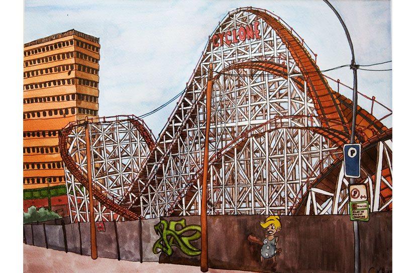
Christophe Lopez-Huici’s illustrations had a nice balance of color and a fastidious attention to detail. But what set his work apart was his slightly unstable sense of line. He remarked to your commentator that “I don’t really like straight lines.” For example, in this drawing of the Cyclone rollercoaster from his website, the office building on the left is constricts slightly at the center. The telephone poles bend like licorice sticks. Such subtle distortions create little islands of pictorial interest in all the works on view in his cramped hotel room.
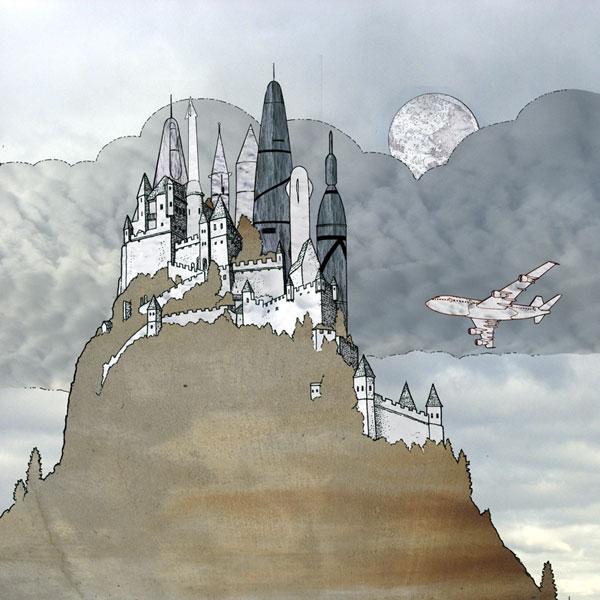
Patrick May’s room was so consistently packed during the opening night that it was hard to get a good peak at his drawings. He depicts castles with all the detail that would make Dungeons and Dragons geek drool. His skies and atmospheres hearken back to that Germanic romantic tradition of Bierdstadt and Church. Some may grumble that these works are mere kitsch, more worthy of trading cards. But the aesthetic remains decidedly crisp.
Angie Arlene Smith also works in the illustration style but with a more restricted pallet. She draws thick black lines that enclose bright bold colors like stained glass. Sometimes when artists try to pull this off it ends up looking more like a coloring book page. But Smith draws with a sophisticated economy.
Part of what makes Pool so fascinating is how – to be blunt – almost every work is the subject of prejudice. Anti-illustration is just one of them. Artfair week is so often about the cash cows that sell so well that the dealer can justify the expense of shipping the work to New York. But what does not sell well today is very often rises as the next big thing tomorrow.
Pool is an opportunity to see works that feel cold to most. Challenge yourself and pick a “chilly” work. Engage with the artist and force it to defrost before your eyes. It’s good practice because finding the hidden warmth of the cutting edge has never been easy.
ZINE
HOME
TIPS / COMMENTS
CATEGORIES
CONTRIBUTORS
- Greg Afinogenov
- B. Blagojevic
- Adda Birnir
- Susannah Edelbaum
- Julie Fishkin
- Paddy Johnson
- Jessica Loudis
- Christopher Reiger
- Andrew Robinson
- Peter J. Russo
- Blythe Sheldon
- S.C.Squibb
- Hrag Vartanian