
This is an archive of the ArtCat Zine, 2007-2009. Please visit our new project, IDIOM.
On the Work of Laura Paulini
Laura Paulini's work, along with that of Derrick Melander Penelope Umbrico, was recently on view at Repetti Gallery in Long Island City.
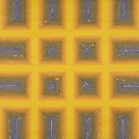
Laura Paulini paints with her lucky chopstick. It's a cheap wooden one that she that found with a meal. Yet, the artist soon discovered that when she dipped this particular stick in tempera paint and then dabbed her birch picture planes, the dot turned out chillingly perfect. There is just something magical about the tip's shape and how it holds paint. Paulini theorizes that after many sessions of use the stick has not worn but actually calibrated to her technique. The artist has likewise honed her skill to the qualities of this chopstick. The utensil is so valuable that Paulini was tormented recently over bringing the stick along on her next residency or avoiding the risk of loss and leaving it at the studio. This modest but powerful tool looms behind each of her paintings.
Dot by dot, row by row, column by column, Paulini creates geometric Op Art patterns with a pointillist style. From a distance the Tron-like grid is clear but as a viewer approaches the field dissolves into a series of well placed dots. This game of distance and watching the image modulate with each step is one trademark of good pointillism that her works display with flying colors.
It has now been eighty-nine years since Mondrian's first grid paintings in Paris. The rigidly organized field still manages to touch a nerve on the retina. Let's forgo the predictable arguments over Rosalind Krauss's essays and appreciate the grid's tenacity when so many elements of modern painting now fall flat. The grid is like the friend you still call even though you've spent evenings cataloging his or her flaws. The grid is that dish that your mother never aces, but prepares with that bizarre twist that is her enduring signature. Paulini's work draws upon the grid's bittersweet stamina as recent painting stands between the hard rock of modernism and the harder place of what comes after.
Paulini is well aware that the grid is not perfect. Perhaps that's why each work features lacunas without any dots. These negative spaces interfere just enough with the grid without totally trumping it. By striking this difficult balance, the works display an enticing level of formal tension. In a manner similar to the work of Jeremy Gilbert-Rolfe recently discussed on this blog, she simultaneously embraces and betrays the grid.
The glow that radiates out from her works draws its formal electricity from multiple sources.
First, egg bonds her tempera pigments together. Linseed oil and synthetic agents yellow the hue of the pigments, robbing certain sections of the color spectrum of their vibrancy. The brilliance of egg tempera was most apparent at the recent Fran Angelico retrospective at the Metropolitan Museum of Arts. Both artists hone a technique that unlocks the luminous potential of unjaundiced tempera.
Second, Paulini carefully pairs colors to create radiance. There's the old story about Seurat's fascination with optics and placing opposing colors side by side for good effect. Weddings color in the studio, however, is more visceral than intellectual. There can be a marvelous chemistry between two opposing colors when both bring out a certain aspect in their counterparts. A sculpture by Derick Melander on at the Repetti show view likewise presents two contrasting rings of shoes – one is light, the other is dark. The monocromatic fields of Penelope Umbrico's video art, also installed at Repetti, are the perfect compliment and reveal that there is a tradeoff to viewing colors relationaly rather than singularly.
Paulini remarked to your commentator that that she strives to present work that creates light rather than describes light. This project of creating work with internal radiance can be dismissed by many critics as a purely formalist enterprise. They forget that narrative is not the only semiotic vessel of meaning. The recent pilgrimages to Olafur Eliasson's sun-like Weather Project at the Tate Modern testify to the appeal of shear luminosity at this moment. Attaching a precise meaning to a category as malleable as light is a tricky endeavor. But in an era in which so much art sinks into the dark depths of art and theory speak, there is a certain sparkle in playing it light.
ZINE
HOME
TIPS / COMMENTS
CATEGORIES
CONTRIBUTORS
- Greg Afinogenov
- B. Blagojevic
- Adda Birnir
- Susannah Edelbaum
- Julie Fishkin
- Paddy Johnson
- Jessica Loudis
- Christopher Reiger
- Andrew Robinson
- Peter J. Russo
- Blythe Sheldon
- S.C.Squibb
- Hrag Vartanian