This is an archive of the ArtCat Zine, 2007-2009. Please visit our new project, IDIOM.
Judith Supine at English Kills
Dirt Mansion
Judith Supine
English Kills - 114 Forrest St, Brooklyn NY
12 April - 8 June 2008
For the rest of Spring, a site-specific installation by Judith Supine will be on view at the English Kills Art Gallery in Bushwick, Brooklyn. Supine covers the walls with painted fragments of hot magenta water lilies that shimmer like fluorescent potpourri between the large green figures. This is Supine's first solo show in New York. It is another example of an artist accustomed to working on the streets entering the gallery context.
Supine presents his vibrant green figures under black light. On the day of the opening, half of the main hall was illuminated by incandescent light while the other half was under black light. The artist was so pleased by the appearance of the works under the purple bulbs that he asked the gallery to remove all the incandescent fixtures. A few did manage to remain to emphasize certain works. The black light compliments Supine's glowing color spectrum and the eerie appearance of his green figures.
The history of painters working with black lights is a modest one. Roberto Matta, to cite one example, sometimes painted under black lights but his works are never illuminated as such at MoMA. Matta's production methods fail to leave a mark on the exhibition procedure here, further asserting that in an era of extreme urban light pollution, exhibition spaces still cling to the tired model of the bright white cube. Some spaces, however take steps in a different direction: the 2008 Dark Fair at the Swiss Institute Contemporary Art in SoHo recently examined the display possibilities of candle light. Yet, in this case SI functions as an exception that proves the rule.
Artists, however, can go further than just presenting their work under a strange light. The true test is always whether unconventional illumination can tease out some quality that might otherwise be suppressed in a picture, or enhance the content that is already present. By introducing the realm of the shadow and that outlandish glow of the black light, Supine raises his work to a new level of ethereality.
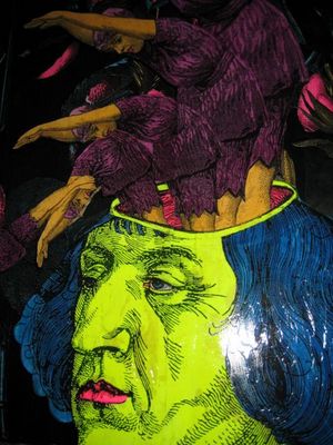
Supine begins his creative process with a pair of scissors. He cuts out captivating figural elements and faces from newsprint, magazines, art history books, fashion magazines, etc. He then arranges these elements into one of his juxtaposed collage figures. Such raw and quirky assemblage figures recall the photomontages of the Berlin Dadaists, particularly Hannah Höch and Raoul Hausmann, as well as the exquisite corpses of the Surrealists. Whereas the Berlin Dadaists and the Surrealists were content with the inherently small scale of figures created by juxtaposed newsprint elements, Supine employs modern technology to magnify these small figural colleges. His collages are taken to Kinkos where they are enlarged and reprinted on a roll of three foot paper. As some news print is black and white while other is color, everything is reprinted in grayscale.
Supine then takes this roll back to the studio and prepares it for coloring. The digital print on the paper roll functions like an underpainting as Supine tints and colors the work. He employs a restricted pallet of a few bright fluorescent acrylics. He paints with one radiant shade of blue, green, yellowish green, violet, hot pink as well as a brownish skin tone color that does not pop. Much as a child fills space in a coloring book with one uniform color, Supine fills each section with one color. Supine's paint application is thin enough to permit the black shadows from the newsprint to puncture the color and create a chiaroscuro across the painted face and body. Each part of the body is a vibrantly colored silhouette. Such bold color contrasts emphasize the strange juxtaposition that create the figure.
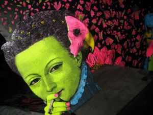
The marriage of green and hot pink is ubiquitous throughout Supine's current installation. It is a fitting color combination for a Spring show. The bright green glows next to a deeper value of the pink. The bright aspect of green simultaneously brings out the radiance within the fluorescent rose color. Gazing at these two shimmering colors side by side under black light is like walking through a mine of emeralds and rubies.
The next step after coloring involves applying a coat of polyurethane. This postmodern varnish enhances the luminosity of the surface as well as preserves the vibrancy of the fluorescent paint. Works from a year ago in the gallery's storage area lack the plastic skin and their colors' intensity has already faded. After the excess paper roll is cut away, the figures are either mounted directly on the wall, or on birch backing in the case of a few freestanding silhouettes.
Roberta Smith recently remarked in a review on small-scale abstraction that strong composition involves a combination of elements in which everything is essential and nothing is superfluous or easily subtracted. Supine grasps that an excess of elements has always been the danger of ambitious collage. For example, when Hannah Höch strived to create a more monumental college, she would extend the collage out like a sprawling Los Angeles suburb. Works such as the frequently reproduced Cut with the Dada Kitchen Knife through the Last Weimar Beer-Belly Cultural Epoch in Germany offer a kaleidoscope of competing elements with no central pictorial focus. Sometimes less is more. Supine is well aware of the potency of compositional economy. His choice to magnify a few cut out elements that he juxtaposes together succeeds where others have gotten carried away. As Chris Harding at the English Kills Art Gallery remarked to your commentator, Supine "knows when to walk away."
There is barely a single smile amidst the sea of green faces in the exhibition. It is a welcome relief from the glut of smiling faces on the subway that promise you too can achieve success. As he snips from media sources, Supine gravitates towards more haunted and twisted facial expressions. Others are chillingly numb and indifferent as though they are obedient drones or doped up beyond recognition.
The exception is the author's portrait that lurks at the bottom of one of gallery's walls. It essentially depicts a reclining woman with two mouths. She grins with one while yawning with the other. Supine is actually a term for lying down with the face up and the portrait illustrates it. The name Judith, which is not male artist's real name, is also significant. It was Judith in the bible that decapitated the head of Holofernes. The artist's process could be seen as amputating newsprint figures and reassembling them as colleges. This playful author portrait also appears to give birth to green figure jettisoning out of her lower half. It is a whimsical reference to the artist's green creations. The male artist here plays with a female persona to illustrate his own artistic identity.
The symbolism of amputation was very current for the first collagists during Berlin Dada as a generation confronted the amputated veterans of the first World War veterans in the street everyday. Supine mines this amputation idea, which is arguably inherent to this process of cutting up figures in magazines and newsprint. The back wall depicts a glowing, bright green hand holding a pair of scissors that have apparently severed the fingers on the opposing hand. A pile of green fingers accumulates below the hands.
The choice to render many of the faces as green reinforces the unsettling content of the facial expressions. The green face may summon the Wicked Witch of the West most immediately but there is a long history of goblins, ghouls and zombies in western fairy tales and fantasy novels. The green face taps into that primal negative reaction we have towards a greenish or yellowish faces as a sign of ill health. Such bizarrely tinted faces can be caused by jaundice or liver failure. The total significance of a green face might run a bit deeper than the meaning of sickness. Evolutionary psychology considers the neurological legacy of traits and patterns hardwired during homo-sapiens' relatively long stint as hunter-gathers. This exciting strand of psychological theory has yet to be fully mined by critical theorists and cultural critics. When survival was a matter of the shear vitality to survive the elements and exert the physical strength to hunt and gather, selecting a mate of weak constitution could have serious and dire consequences for the clan. They would be no clearer sign to gauge health than the discolored face. Hence, the way we view faces is arguably influenced by this suppressed animalistic heritage. By no surprise, our minds react coldly to sickly complexions and warmly to healthy complexions. Yet, this cold reaction has a gloomy appeal, which these works marvelously access.
There is a tension between the radiant meaning of the face's shiny emerald color and the darker meaning of the sickly green face. Each work is energized by this fusion of beauty and terror that is the essence of the sublime. The green figures resist the categories of the goblin, the ghoul, the zombie, or some other green creature lifted from a Hieronymus Bosch painting. They are lighter and lack a disfigured monstrous appearance. Yet, their green color is still arresting and not as neutral as the bright yellow skin of the Simpsons towards which one's gaze quickly acclimates. These faces float is some sublime limbo between the well established categories for green figures. Your commentator spent a great deal of time with the gallery's director trying to find the right verbal category for this imagery – but it simply doesn't exist.
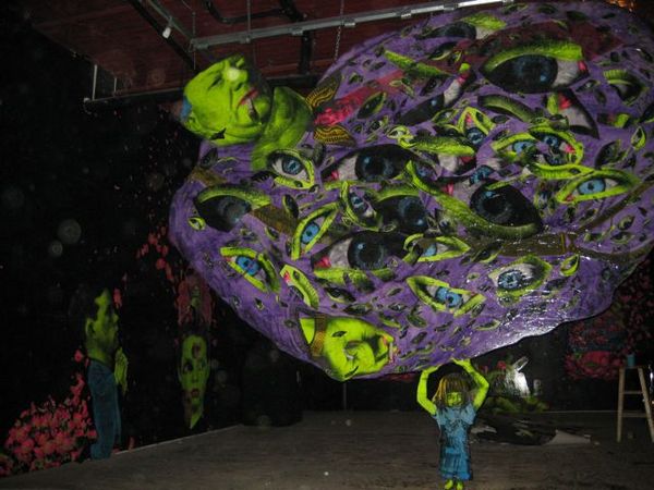
At the center of the room there is a suspended work that depicts a sea of eyes superimposed over the belly of an obese smoking man. The irises are painted with a shiny blue and they shimmer like sapphires under the black light. At the very bottom of the work, a small greenish girl holds up the fat man like Atlas. We live in an era where fat old cats view the next generation as a credit card to finance a war that lines their pockets. Our youth will bear the load of this indulgent recklessness.
Supine is equally comfortable away from the human figure in the realm of abstract composition. This arrangement of eyes on the belly exemplifies Supine's ability to strike a balance between the potency of economy and the impact of many elements working together in the picture plane. It appeals to the aesthetic pattern of the "shattered mirror scattered across the floor." However, if the shards are packed to densely together or if the field stretches to wide, the aesthetic effect can quickly diminish. Supine masters this same effect with the groupings of pink flower fragments on the other side of the floating obese man. They swim across the picture plane like a school of pink electric eels.
Supine's work plays with luminosity on multiple levels. He paints with fluorescent paints that are inherently bright and vibrant. Each work receives a layer of polyurethane that leaves the surface reflective. The entire exhibition space in then cloaked in black light, which brings an eerie glow to every work and the entire space. Such interlocking layers of radiant complexity create a show that enthralls viewers like moths fluttering before a flickering flame.
ZINE
HOME
TIPS / COMMENTS
CATEGORIES
CONTRIBUTORS
- Greg Afinogenov
- B. Blagojevic
- Adda Birnir
- Susannah Edelbaum
- Julie Fishkin
- Paddy Johnson
- Jessica Loudis
- Christopher Reiger
- Andrew Robinson
- Peter J. Russo
- Blythe Sheldon
- S.C.Squibb
- Hrag Vartanian


