
This is an archive of the ArtCat Zine, 2007-2009. Please visit our new project, IDIOM.
Reviews Archive
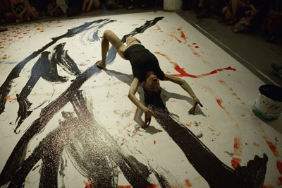
The International Studio & Curatorial program, a former warehouse wedged conveniently in East Williamsburg next to an egg factory and a few fungus-like new condos, is the perfect place to serve as host to visiting artists and curators. Not too big, the space has only a few galleries open to the public while the rest of thie building is home to studios for international artists in residency for the year. Inviting and manageable, this charming space held an intimate evening of performances by artists who incorporate music into their work, or did so at least for Hear Myself In It an evening of music set against the current exhibition up at ISCP titled On the Tectonics of History.
At NURTUREart’s exhibition for the Bushwick Biennial, the intent is to focus on “utopia, urban change, and the role of a place in artistic identity” but the resulting show is dreamier and niftier than those themes might imply. Entering the gallery made me imagine walking into a human-sized, contemporary version of one of Joseph Cornell’s boxed assemblages.
Going upstairs to the show is a gradual, gentle process, beginning with the trailer parked outside the building, which houses a garden complete with a pond and love-seat length bench (there is a tiny, even cuter prototype of Kim Holleman’s work, Trailer Park, in the gallery itself.) The show is sandwiched by gentle, repetitive pieces – the stairs leading to the space play host to Escalator Helix Vertical, an animated illustration of spinning escalators, and the gallery’s adjacent rooftop is covered with Audrey Hasen Russell’s Beam Tower with Pink Grass, which is what its name implies – coils and coils of cotton-candy-colored pink foam which have been cut into spiky forms to look like grass.
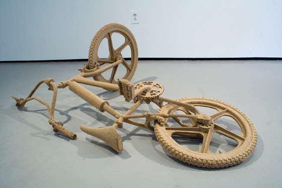
I really liked this show, though I expected not to. My last experience with earnest-seeming art in Bushwick was…I can’t remember when. I may have never seen it before. Benjamin Evans, who curated the show for NURTUREart, has done an incredible job of putting together something appealing, and sometimes even cute (be sure to see The Farthest City, by James Reeder – it’s a charming wall-mounted utopia) that still maintains a sense of humor and a healthy sense of dignity. A perfect example is Fallen, Jonathan Brand’s prone fiberboard bicycle. The life-sized, super-accurate apparatus lies on the gallery floor in front of three petite drawings depicting a biker in various stages, the last of which shows him on the ground next to his similarly horizontal bicycle. The drawings are sweet, and they’re funny, and they’re good. Please go see this show. Its so nice to encounter work that is simultaneously compelling and funny.

The figurative rendering of a cultural imaginary is not new terrain. A good deal of work consists simply in recording the exaggerations and misreadings ostensibly structuring our collective unconscious. At worst this tendency amounts to little more than vapid expressionism mistaking itself for critical sociology, an effect often exaggerated by an ongoing game of pin-the-identity-tail-on-the-ideological donkey. At first glance, Liao Yibai's Imaginary Enemy, seems a prime candidate to continue this unfortunate tendency. A series of sculptures "explor(ing) how (the) Chinese imagined the myth and threat of America during and immediately following the Cultural Revolution," Yibai could easily have repeated any number of well-worn narratives and nobody would have blamed him. He would merely have been repeating what is perhaps the signal error of this mini-genre, mistaking what is true for what is compelling and relying on brute force of polemic or moral clarity to do the work of the aesthetic object,
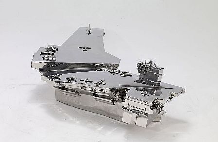
Yibai, by contrast, and to his great credit, hews very close to his own idiomatic experience of these cultural myths. He chooses for his studies those moments that reveal himself and his world in tandem, preventing a fall into wrote commentary. Thus PLA Whiskey, a massive, stainless steel Jim Beam bottle, with certain details spelled out and certain others reduced to squiggles, "recalls the story of a former Chinese soldier’s dream of forbidden American alcohol." Cash Fighting is a delightfully literal representation of the economic struggles between China and the US, and has Benjamin Franklin leaping out of a one-hundred dollar bill to box with his Chinese counterpart. Its a simple, comical gesture - but also a poignant one; realizing a childlike comprehension of conflict in the broadest of strokes. Less monumental but more effective is a series of aircraft carriers, repeated as a progress of somewhat amorphous polygons, each with its own series of smaller shapes on deck. Rendered in the same, shiny steel as all the pieces here, these ships capture the American presence in the South China Sea as a hard and inscrutable power, difficult to comprehend at the level of its individual parts and machinations. Its an altogether effective presentation. The show is open until August 15.

Blanks, Templates, Undos, Redos, Matt Sheridan Smith's debut solo exhibition at Lisa Cooley, is comprised of opaque sculptures and drawings which occupy a vague, transitional territory despite their resemblance to several ubiquitous forms in present day work-life.
The show's sole video, Untitled (open/shut), 2008 (all other works 2009) is a seven-minute montage cut from footage of actors opening and closing doors in Robert Bresson's film, L'Argent (1983). In Smith’s edit, the characters endlessly pass into and out of boutiques, cafés, homes, offices, and other spaces. Departing prompts removed, we’re given the momentary silence of a door swinging ajar, over and over again. Smith’s projection is a figural representation of his blanks, templates, undos, and redos; transitions that never lead anywhere but serve to personalize the concepts of banality operating within the other works on view.
Freedom and Beauty: The Art of Iraqi Refugees
St. Paul the Apostle - 405 W 59th St, New York NY
30 April - 28 May 2009
Everyone's talking about faith these days. In a recent issue of Commonweal, Terry Eagleton suggests that we ought to be attentive to the critical potentialities of religion; they are crucial, he thinks, because they provide an alternative to both radical fundamentalism and liberal-rationalist dogmatism. In a sense, it's easy to see what's at stake for him. Religion as a field of study now fills a niche once occupied by certain varieties of Marxism: it is, paradoxically, an ideologically uninvested space where adventurous approaches are welcomed rather than shunned. If its appropriations of Heidegger and Badiou are occasionally unrefined, it is because it's still something of a critical frontier.
The exhibition Freedom and Beauty: The Art of Iraqi Refugees, on view this month at St. Paul the Apostle Church, brings this frontier quality immediately to mind. Its engagement with theory, to be sure, is minimal. Nonetheless, the aggressive way in which it breaks with curatorial common sense is something of a statement in its own right. Paintings by four artists are arranged on a single display stand, crammed sardine-like into a few square feet. (Another artist is displayed on a slice of adjoining wall). The accompanying exposition in the press release and wall texts spends vanishingly little time on the paintings themselves. It focuses, rather, on the circumstances of their production, as even the title suggests. It describes the artists' experiences in war-torn Iraq and emigration, positioning the work itself as merely a response or an expression of the crisis — anything but l'art pour l'art.
But just as it makes little effort at any move towards something like contemporary exhibition practice, the exhibition also avoids making explicit political statements — it identifies neither culprits nor solutions — and, more strikingly, proselytizing. The objective seems to be the establishment of an interspace between traditionally ecclesiastical, artistic, and political sites and styles of dialogue. Though perhaps this is a grand claim for what is, after all, a fairly modest undertaking, its organizers are hardly strangers to such projects: the exhibition is the work of the Paulists, a missionary order that sees new media and cross-cultural exchange as fundamental to its evangelism. Freedom and Beauty, in short, represents a kind of religion even a Marxist like Eagleton can approve of. It is hard not to applaud the effort or appreciate its undermining of the borders between cultures and professions.
Paintings and Pots
Sarah Crowner
Nicelle Beauchene Gallery - 165 Eldridge
26 March - 3 May 2009
Familiar New York soot thinly coated the bone-dry, paper-white surfaces of Sarah Crowner’s misshapen natura-morta rendered three-dimensional. Her decision to place five white vessel sculptures in the shoulder-high window of Nicelle Beauchene Gallery seemed particularly strange at first. However, this earnest arrangement begins a dialogue between art histories through a quiet re-contextualization of medium specificity. Paintings and Pots, the title of Crowner’s first solo exhibition, would come to seem mostly inaccurate.
Two other groupings of endearingly crude, achromatic vases also ignore carefully balanced tone and composition in the referred still-life paintings of Giorgio Morandi, forbearer to the Minimalists, setting off a kind of referential play that continues within the other works on view. Crowner’s canvases, which command the show, employ a restrained palette and bring to mind the male-dominated canon of 1950s and 60s Post-Painterly Abstraction. Though unlike those surfaces, her works divide into roughly textured linen, painted canvas, and solid-colored cloth, thereby re-introducing a handmade element to the cool touch in painting by figures such as Ellsworth Kelly. In two acute compositions, both titled Dichromatic Organization, 1959 (2009), a tension vibrates between the pictorial and physical components. The accelerating, triangular slices found in the work of Swedish painter, Olle Baertling (1911-1981, explicitly referenced in press materials) are sewn together by Crowner in a manner reminiscent of Miriam Shapiro’s (1923–) innovative fabric-and-canvas assemblages. Shapiro, a forerunner of the Pattern and Decoration Movement, began her career as a hard-edge painter.
Crowner’s canvases also piece together, and in some cases seem to pull-apart the gendered concepts of craft and high-art while joining the delimited surfaces within slick, hard-edge painting. Her use of a sewing machine evokes obvious notions of “women’s work,” while the substitution of cloth for paint returns the viewer’s gaze, checked: where one normally expects to see paint, a seemingly flat and more illusionist, yet tactile, fabric comes into focus. Crowner succeeds in historically grounding two disparate eras, but are the resulting objects a reconciliation or reclamation? How and in what ways do we distinguish art from craft, and which artists bothered to ask such questions?
Towers and Portals
Rachel Beach
7 March - 12 April 2009
Show has been extended
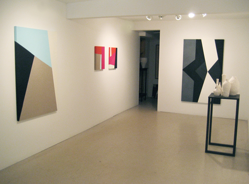
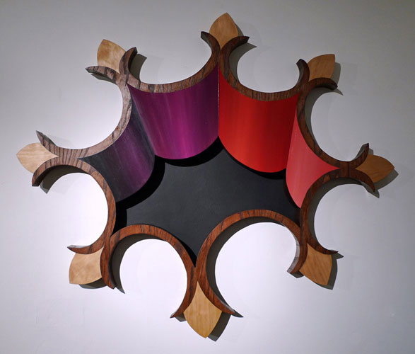
Towers and Portals, at Like the Spice Gallery, is Rachel Beach's second solo exhibition in New York. Beach's seductive sculpture-paintings are postmodern, playful explorations of relativistic perception. Using oil paint and a technique called veneered marquetry, the artist creates trompe-l'oeil forms that easily segue from a two-dimensional to a three-dimensional reading and likewise maneuver between ornamentation and cleverly subversive commentary. Remarkably, the works are as sincere as they are arch.
Impressed with her previous solo effort, Chicken & Egg, at HQ Gallery, I worried that Towers and Portals might evidence a sophomore slump. Happily, Beach avoids that pitfall. Although this nit-picky viewer did notice two instances of hurried handiwork -- some uneven paint on the exhibition centerpiece, The Mothership, and stray paint spotting above Benevolent Universe (yellow and pink) - the large and varied collection of sculptural works on hand at Like the Spice is generally first-rate. In fact, it was Beach's superior craft that compelled me to search for defects in the first place.
Without
Meleko Mokgosi & Matthew Watson, Without
Work - 65 Union Street, Brooklyn NY
27 March 27 - 20 April 2009
Without, an intimate exhibition of new works by Matthew Watson and Meleko Mokgosi at WORK Gallery, toys with the definition of its seemingly simple preposition. Usually implying an absence or lack, in its most archaic form it connotes the external. It is there, in the negotiation of topical superficialities with self-identification and cultural expectations, that these two very different artists meet conceptually. In their hands, paint itself becomes a metaphor for experience.

With aristocratic portraiture as his touchstone, Watson’s images of Brooklyn locals demonstrate a true art historical praxis but with a twist. The Greenpoint immigrant of Untitled Portrait lacked even the basic English skills to share his name or identify himself — really to fulfill even the essential purpose of a portrait. The closely cropped composition and decontextualized background makes the grotesque surface of his splotchy, red face the lone signifier of his identity. Appearing to suffer from the side-effects of heavy alcohol consumption in the form of extreme rosacea and severely damaged capillaries he fulfills the stereotype of a drunken, lethargic immigrant.
Steeped in the methods and materials of Old Masters, Watson’s process counters this presumption in subtle ways. Over a period of months, he meticulously layered oil paint mixed with powdered Venetian glass and fir balsams upon a copper plate, an extremely labor-intense medium. Watson’s large investment of time and materials upends the value system of a society that marginalizes its newest members, while the very choice of a marginalized, undervalued subject undercuts the fetishization of the art object.
The problem of critiquing the critical lingers large in the realm of performance. This is due, I suspect, to the fact that unlike any other serious medium, there remains a powerful industry devoted to psychological realism – the well-made play and the like. It's an industry that, in short, still orients itself by a 19th century standard of beauty. Jokes about painting non-withstanding, this is not the case in the art world, which is now several generations removed from the introduction of the abstract, the conceptual, and the critical into the edifice of its reception. Most patrons of performance and many of its producers, by contrast, are often, and at best, only dimly aware of some other history lurking in the margins. This obvious tragedy has many causes, and many more symptoms, one of the most pernicious being the general lack of a common vocabulary amongst critics, producers, and artists. It is no surprise, to put it another way, that so much of contemporary artistic practice relies quite heavily on an apparatus of orientation existing outside the work itself: the press release, the brochure, the critical assessment. Over time these many bits of explanation collect and calcify into a thriving community capable of digesting, even demanding, an ever-evolving, relentless assault on the status quo.
Double Take
Johan Grimonprez
Sean Kelly - 528 W. 29th St, New York NY
7 March - 21 March 2009
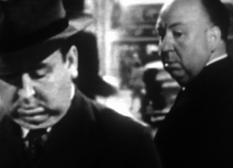
Folgers coffee has never been so apt a metaphor. Johan Grimonprez's new film Double Take, on view this month at Sean Kelly Gallery in Chelsea, is punctuated by several decades' worth of advertisements for it, and for good reason: it's the archetypal “double.” The doting wife, always unable to satisfy her husband's quasi-erotic demands for good brewed coffee, replaces it with instant. The husband can't tell the difference — but the audience is left with an uncanny sense of foreboding, as if its own coffee cups were in imminent danger of being surreptitiously substituted for something else. This vague anxiety is the foremost feeling evoked, and cultivated, by Grimonprez's film.
Double Take is a long and tightly-controlled examination of the double on a variety of levels, yet it remains admirably disciplined in its selection of motifs. The topic, after all, is so extensive and so firmly-rooted in Western culture — another artist would have felt obliged to reference Cervantes or Joseph Conrad — that a treatment trying for breadth would inevitably have become a catalogue.
Here, there are only a few primary strands to untangle. The spine of the story is provided by a Borges essay, reworked into a preternaturally plausible account of Alfred Hitchcock meeting his double. Hitchcock's doubles in fact populate the whole film, along with Hitchcock's own on-screen and off-screen personae. The difference between the two becomes less clear and less relevant as the narrative proceeds; by the end, we are left with barely anything more than the stylized, trademark silhouette, filled out by an ever-shifting array of characters. The original Hitchcock, it seems, cannot help becoming his own murder victim — for, the film insists, if you meet your double, you must kill him.
ZINE
HOME
TIPS / COMMENTS
CATEGORIES
CONTRIBUTORS
- Greg Afinogenov
- B. Blagojevic
- Adda Birnir
- Susannah Edelbaum
- Julie Fishkin
- Paddy Johnson
- Jessica Loudis
- Christopher Reiger
- Andrew Robinson
- Peter J. Russo
- Blythe Sheldon
- S.C.Squibb
- Hrag Vartanian